Thinking... Planning... Getting Ready

CQJP2015 5
One day in the not so distant future, God willing, I will finish my CQJP 2015 project.  As it nears completion, how to put it together is on my mind with each stitch I take and each new seam that I complete.  There is much thinking and much consideration taking place as to how to put these blocks together.  

While I briefly considered stitching the blocks directly to one another, I realized that I would prefer to put some sashing between the blocks and let each one shine individually. 

CQJP2015 10
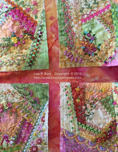
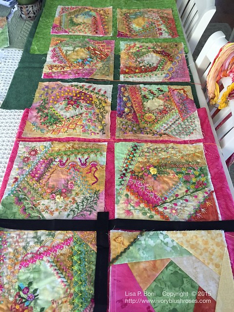
My initial thought was to use some pink/yellow/orange fabric for the sashing.  I have some of this in my fabric stash, though not enough to do the entire piece.  When I visited a quilt shop and we looked at this option, it was thought that the blocks got lost a bit on this fabric. 

I did try some yellow fabric, but I wasn't at all fond of the look.  Too much yellow!  Not to mention that somehow the blocks got lost on it.  Orange fabrics weren't any better.  

CQJP2015 4
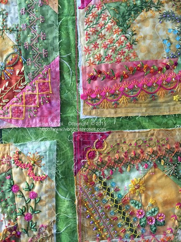
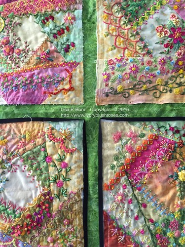
I like the idea of using a bright green for the sashing.   That would help it hang in my home better, since green is a predominant color in my home along with white, ivory and natural linen.  While brighter than the majority of my home decor, at least it would coordinate.  But the blocks do seem to blend in and don't stand out as well.  

CQJP2015 3
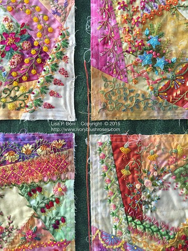
 Then I thought that maybe a darker green was in order.  It does make the blocks stand out, but this particular green is far to muted to work well with the blocks.  This one is out of the running.  

CQJP2015 2
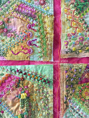
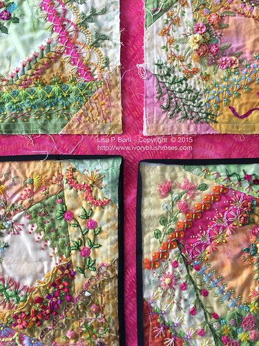
So what about using a bright pink for the sashing?  It does make the blocks sing and brings up the brightness of the stitching, as well as minimizing the yellows a bit.  What surprised me was the best pink fabric also had a lot of orange in it!  I'm still not quite sold though.  If I use pink sashing, I seriously doubt that I'd ever hang the quilt in my home as it is simply too bright, though it certainly would be joyful! 

CQJP2015 1
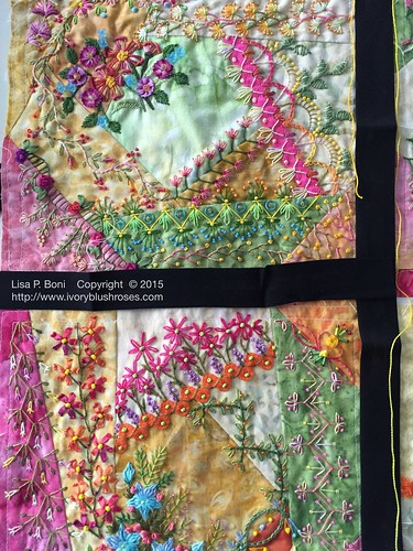
Then I thought about using black for the sashing.  Just narrow bits, about an inch to inch and a half wide. It does seem a bit stark, but I'd use a combination of golden yellow and bright pink stitching along the seams if I did this, similar to this glorious quilt created by Elizabeth Frolet of Georgia (scroll down to the bottom of the post for her lovely,"Elizabeth's Garden, A Tale of a Thousand Threads" quilt)

CQJP2015 8
Then again, I could use that green that I like and add a simple narrow black frame to each block, rather like a stunning bit of stained glass! 

CQJP2015 7
Or how about on the pink fabric with the black framing?  

Truth is, I'm still as unsure as ever about how to finish this.  My ultimate goal is to make this the best CQ that it can be, secondary is whether I'd hang it in my home!   I'd love to hear your thoughts on which option you like best and why! 

Comments

You asked, so....my vote goes to the green with the teeny little bit of black. I like the idea of green because there are so many flowers in the CQ'd pieces and green would signify leaves.
traderslostart said…
Your blocks are so very beautiful . . .
I like this comment and the picture that goes with it,
"green and add a simple narrow black frame to each block,
rather like a stunning bit of stained glass!"
I think it is best to use a color that looks good, and that
you would love to have, hanging in your home.
It would be a shame not to be able to see it daily.
I think it will be spectacular when it's bordered.
God Bless you Lisa
Wow, it is hard to really tell with a smaller photo but the black IMHO is too stark and the bright pink overpowers the blocks. The lighter green looks more pleasing and I'm even wondering what a blue might do, or even a tan/ecru/taupe with narrow green bands? Your blocks are beautiful and you have a great eye for color (and you have it all in front of you). I'm sure whatever you choose will be perfect.
Cathy said…
I agree that the black as sashing by itself is too stark, buit might be lovely as a frame with the pink or bright green as sashing. You don't think you'll hang it if it's too bright? I thought bright was the point, the stretch for you. It is too beautiful NOT to hang, "matching the decor" be damned! I think CQs are beyond the rules in decorating, LOL. JMHO.
SallytotheMax said…
My first thought would be the lighter green, without the border. However, I reserve the right to change my opinion. Generally I'm slow because I need a while to mull it over ;)
Most definitely black framing, but it's not easy to decide between the pink which really pops, or the green. Being partial to green, I think that's what I'd choose if it were hanging on my wall. Those blocks are so absolutely gorgeous, by the way. I'm sure I've said it before.
I'd go with your last photo over all the rest. I think black edging on hot pink sashing is going to rock this awesome hand embroidery. And by the way, I host the popular Clever Embroidery Series on my blog, I'd love to invite you to allow my to profile your work in this series.

carli the quilter at gmail dot com
I like both the green with black around blocks and the pink with black around each block. Either way is really nice and makes the blocks stand out. It makes you stop and look at all of the details in each block.

Beautiful work ~ FlowerLady
Sherry said…
Lisa, what about the green sashing with the narrow band in the hot pink or vice versa? I definitely understand your wanting it to hang in your beautiful home without being jarring to the eye. I just love these blocks and admire you for stepping out of your comfort zone with such exuberance!

Sherry in Little Rock
Anonymous said…
The light green without a black border looks the best to me. I find that the black Ford hair cuts off the flow that you create with the green. The green seems to pull out the smaller amounts of greens that are in your blocks. In any case that's my vote.

Lin said…
Hello Lisa. I prefer the bright green without the narrow black band. My second choice would be the black sashing. Lovely to find your beautiful work and your blog. xx
bonniekin said…
I would really like to see what they look like with a blue sashing. You didn't use blue in the fabrics, but it is an accent in all the blocks... The only question is what shade of blue... Maybe the same as the stitching with a navy frame????
Suzie in Idaho said…
These are so beautiful. I was instantly drawn to the green. I like it with the tiny black frame too. You seem much more comfortable with the green in your comments, and it is far too lovely not to hang. Stretching your boundaries is good, but you must be comfortable with it too, or it will annoy every time you see it. It is such lovely work. I enjoy every post. Have fun deciding.
Jani said…
I, too, decorate my home predominately green. I fell for the narrow black edge next to the green, (though I know there is a green you would probably like better). My second love is the pink and black, but I know that won't hang in your home. The entire piece is such a joyful explosion of spring, Easter, new life, new growth that I return to the green and black. Best of luck in your discernment. Jan Myhre, Spokane, WA
Heather said…
I love the green and black. It reminds me of a garden path that you could wander down. Having beautiful things to look at every which way.
hpk said…
My first choice is the pink with no black framing. My second is the green with the black framing. Like you said, it's a show piece. If you want to hang it it your home for late summer, do it with the Pink with no framing. If it's for show getting others to stitch, do the green with black framing.
Sarah Aldrich said…
I really like the way the pink makes the colors pop, but don't think you should use it if you won't use it in your home. My second choice would be the green with black; however, I think you should audition a narrow pink band with the green instead of the black with the green. You might find that it gives you the best of both worlds. Happy stitching! - Sarah
Susan Elliott said…
Wonderful!! I vote green, no black...IMHO...but I know you'll make the best choice for you. These are absolutely wonderful!!
suz said…
I'd definitely use black in some way - it would allow the work to sparkle! This is going to be a magnificent quilt!
Unknown said…
Did you audition any grays? Maybe a medium or dark gray... I think, you could use gray as the small strip with the green or pink sashing or all alone. The black seems so stark, IMO.
Diane said…
Hi Lisa, I'd definitely use the green that you love. What good is a beautiful quilt if it's packed away? I like what Sarah said about the green with a thin pink outline. I think the black is too severe. Happy Thanksgiving! Di
Unknown said…
I vote for the pink, but I wouldn't just leave it as pink, I would do a feather stitch in green over the Sash. I think the pink pops, but the green would help to tie it into your home.

Brenda58 said…
You inspire me with your beautiful work. I would go with black-it really makes the colors of the blocks stand out.

Popular Posts